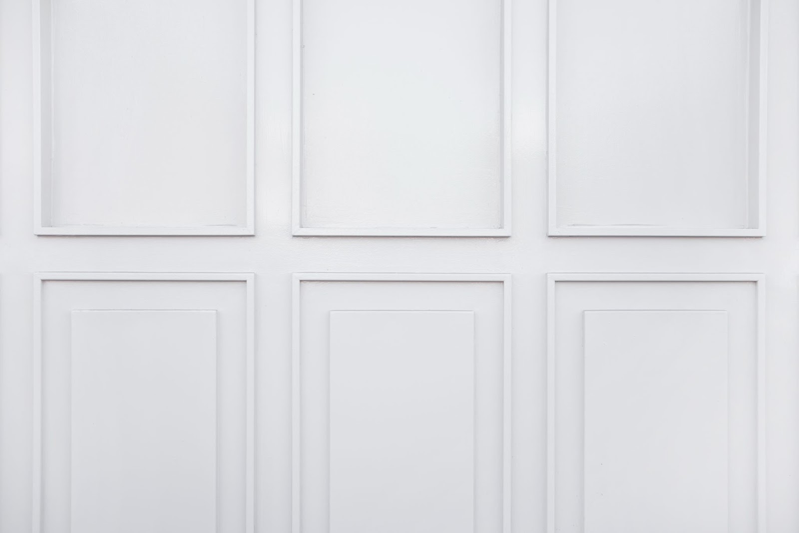
In the ever-evolving world of interior design, the quest for creating spaces that are not only aesthetically pleasing but also deeply personal and inviting remains paramount. One design element that has stood the test of time and continues to make a resounding comeback is picture frame molding on walls. This timeless architectural detail, once associated with grandiose palaces and stately manors, has found its place in modern homes, adding an exquisite touch of sophistication and character to any room.
Picture frame molding, with its rich history and versatile applications, offers a unique opportunity to transform bland walls into works of art. Join us on a journey that unravels the beauty, versatility, and timeless charm of picture frame molding, redefining the way you perceive your living spaces.
Creating Striking Picture Frame Moulding Designs for Your Walls
Designing and installing picture frame molding on your walls can be an exhilarating creative endeavor. Whether you’re a seasoned DIY enthusiast or a newcomer to home decor projects, this comprehensive guide will walk you through the process, step by step, ensuring that your walls become a true work of art. Remember, while every wall is unique, mastering the design phase sets the stage for a flawless installation.
Designing the Perfect Picture Frame Moulding Plan
Picture frame molding, often referred to as wainscoting, can dramatically transform your space, adding elegance and dimension. Here’s how to get started on crafting a captivating design:
A. Selecting the Ideal Wall
Begin by identifying the wall where you want to install the picture frame molding. Consider starting with a wall that offers a blank canvas, like the one adjacent to a hallway or entryway. Fewer obstacles will make your design process smoother.
B. Measuring for Precision
- Height Measurement: Measure from the top of the baseboard to the bottom of the crown molding. Ensure accuracy by using a reliable tape measure or laser level;
- Width Measurement: Measure the width of the wall from left to right, taking note of where the wall ends and any adjacent features, like stairways, begin.
C. Finding the Right Balance
Achieving balance in your design is crucial. Here are some tips:
- Opt for an odd number of boxes for visual interest;
- Ensure that your picture frame moldings strike a harmonious balance on the wall, avoiding extremes of being too large or too small.
D. Pay Attention to Detail
- Box Placement: Experiment with box placement. Consider dropping the tops of the picture frame moldings below the crown molding for added architectural appeal;
- Consistent Gaps: Maintain consistency by keeping the distance from the bottoms of the boxes to the baseboards the same as from the tops of the boxes to the crown molding.
E. Artwork Integration
Before finalizing your design, hang your artwork within the picture frame molding layout to ensure a balanced composition. This step ensures that your artwork aligns harmoniously with the woodwork, enhancing the overall visual impact of your wall.
Installation – Turning Your Design into Reality
With your meticulously crafted design in hand, it’s time to bring it to life through installation. Here’s what you need to know:
A. Gather Your Materials
Ensure you have all the necessary tools and materials, including:
- Picture frame molding;
- Measuring tape;
- Level;
- Saw;
- Nails or adhesive;
- Paint and primer;
- Safety gear.
B. Precise Installation
- Start with the Baseboard: Install the baseboard molding first, ensuring it’s level and securely attached to the wall;
- Box Placement: Attach the picture frame molding boxes according to your design plan, using your measurements as a guide. Be sure to maintain consistent spacing between them;
- Crown Moulding: Finish by installing the crown molding, again ensuring it’s level and snugly in place.
C. Finishing Touches
- Fill and Sand: Fill any gaps or nail holes with wood filler and sand the moldings to achieve a smooth, finished look;
- Painting: Apply primer and paint to match your desired color scheme. This step should be done with precision to enhance the visual appeal of your moldings.
Installing Wall #1: Mastering Mitered Moulding Installation
Picture frame molding installation may seem straightforward, but achieving flawless corners can be a challenge. Fear not; we’re here to guide you through the meticulous process. In a future post, we’ll delve deeper into the art of cutting miters, but for now, let’s focus on how Wall #1 came to life.

Wall #1 Installation: Step-by-Step
- Far Left Frame: Begin by installing the leftmost picture frame molding. This acts as your starting point, setting the foundation for the entire wall;
- Far Right Frame: Next, move to the far right and install the corresponding frame. This ensures symmetry and balance;
- Middle Frame Placement: Finally, fix the middle frame. This strategic order allows for minor spacing adjustments, ensuring your design remains equidistant from both ends. Remember, precision is key.
Designing Wall #2: Bridging Dining Room and Foyer Elegance
Wall #2 presents a unique challenge, serving both the dining room and foyer. Let’s navigate this design puzzle and create a seamless transition.
Dining Room Section (Below Chair Rail):
- Preserving Consistency: If you’ve previously added picture frame molding below the chair rail, match the exact molding. Kudos to Home Depot for keeping the same stock available;
- Upper Frame Width: Design the upper picture frame moldings to mirror the width of the boxes below the chair rail. This uniformity preserves a balanced appearance;
- Height Harmony: Maintain visual harmony by aligning the vertical spacing between the crown molding and chair rail with the lower boxes. This echoes the symmetry achieved in Wall #1.
Foyer Section (Behind the Ladder):
- Height Continuity: Extend the height of the picture frame molding by the front door to match the foyer’s dimensions, following the principles established in Wall #1;
- Customized Width: To maintain aesthetic balance, adjust the width of the frame based on the unique visual context of this corner and your planned accessories. Strive for a harmonious blend with Wall #1.
Designing Wall #3: Taming the Illusion of Size
Wall #3 offers a peculiar visual challenge. Identical frames may appear different in size due to their placement. Here’s how to conquer this optical illusion.
- Size vs. Perception: When frames of the same size grace different walls, they can appear smaller on larger expanses. Don’t let this illusion bewilder you; it’s all about perception;
- The Power of Paint: Here’s a secret weapon—paint! A consistent wall color for both walls and trim can minimize or even eliminate this visual trickery. Trust your measurements and wait until the paint’s on the wall for a final assessment. You’ll be amazed at the transformation.
Pro Tips for a Flawless Finish:
- Measure Thrice, Cut Once: Precision is your ally; triple-check your measurements before making any cuts;
- Paint Matters: Invest in high-quality paint that matches your trim color for a seamless look;
- Visual Harmony: Keep an eye on the overall balance and symmetry of your design, especially when spanning multiple walls;
- Accessorize Wisely: Plan your decor and accessories to complement your moulding design, ensuring a cohesive look.
Creative Solutions for Designing Around Common Design Challenges
Designing your living space can be an exhilarating journey, filled with endless possibilities and creative opportunities. However, it’s not uncommon to encounter design problems along the way, leaving you wondering how to make the most out of an unexpected situation. In this guide, we’ll explore some ingenious strategies for tackling these challenges, using real-life examples from a home improvement project.
The Hidden Frame Dilemma
Imagine you’re in the midst of renovating your room, and you’ve just added beautiful frames below the chair rail. Everything seems perfect until you discover a slightly smaller frame hidden behind your hutch that nobody will ever see—except for you! Don’t fret; here’s how to address this design problem:
1. Concealment with Care
- Place the smaller frame in a less conspicuous location, ensuring it’s out of the main line of sight;
- Use the surrounding décor to divert attention away from the smaller frame.
2. Symmetry Matters
- Balance the space by adjusting the spacing between other frames to compensate for the size difference;
- Opt for symmetry in your design layout to maintain visual harmony.
3. Illusion of Size
- Experiment with lighting to make the smaller frame less noticeable;
- Paint the smaller frame in a color that blends seamlessly with the wall to create a cohesive look;
- Remember, what may seem like a design hiccup can often be turned into an opportunity for creative expression, making your space uniquely yours.
Wall #3: Tackling Asymmetry
Now, let’s dive into a specific example. Wall #3 presented an issue with frames that weren’t uniformly sized. Here’s how the problem was solved:
1. Consistency is Key
Ensure that frames on one side of the wall match those on the opposite side in terms of size and spacing.
2. Creative Camouflage
- Strategically place the non-uniform frame where it’s least likely to attract attention;
- Use the overall layout to distract from the size discrepancy.
3. Perspective Matters
Remember that what may seem glaringly off-center up close might not be as noticeable from a typical viewing distance.
Wall #3 showcases that design issues can be tackled gracefully, ensuring your space remains visually appealing and cohesive.
The Delight of Wall #4
In contrast to the previous challenges, Wall #4 was a breeze to design and install. Here’s what made it a smooth experience:
1. Replicate Success
Use the same panel sizes and spacing from successful designs (e.g., Wall #2 and Wall #3) when applicable.
2. Tailored to Fit
Customize designs to suit unique spaces, such as panels above windows, ensuring they seamlessly integrate into the overall composition.
3. Consistency is Aesthetic
Maintain uniformity in design elements to create a sense of harmony throughout your space.
Wall #4 demonstrates the ease of design when sticking to proven strategies and embracing adaptability when needed.
In the world of interior design, challenges are opportunities to showcase your creativity and resourcefulness. By following these strategies and learning from real-life examples, you can transform design dilemmas into stunning features of your home.
Conclusion
That’s the essence of it, in a nutshell. Crafting wall picture frame molding primarily entails achieving a harmonious equilibrium while wielding an abundant supply of masking tape, if you can believe it!
